
A NEW WAY OF PRESENTING YOUR CAR STOCK! CAN IT BE DIFFERENT?
9 januari 2023, PaulWhat choices do we make at the Ligier Store Doesburg?
One of the reasons to start the Ligier dealership was that I like to test in practice some things that I proclaim in articles that seem logical. I am often amazed at how we deal with the SRP and VDP page on our own website, for example. I definitely don’t want to say that my SRP and VDP pages are the best, there are so many good roads that lead to the same goal, but I would like to show why we make the choices we make.
“The SRP page is perhaps the most important on a car portal! Will you or won’t you get the click to the promised land?”
What does SRP and VDP mean?
For those who don’t know what I mean by SRP and VDP pages, the SRP page stands for Search Result Page. You will see that page if you use search filters on portals such as Marktplaats. We call the search results page the SRP. At the Ligier Store Doesburg we only have one because the stock is not large, but that page is even more important on the portals where our stock is located. The VDP page stands for Vehicle Detail Page and that is the product page. On this VDP page you can call, email and view photos, among other things.
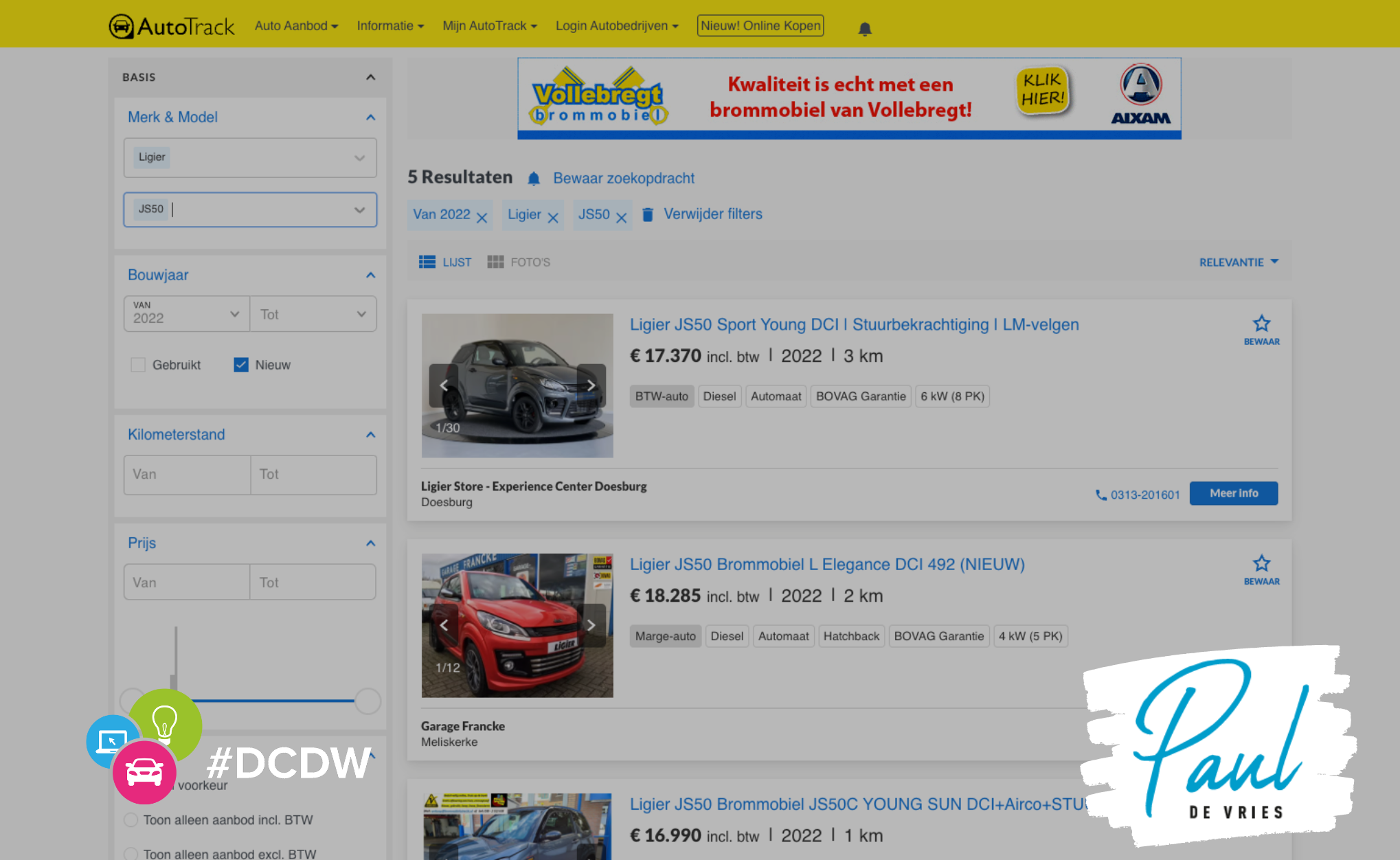
The SRP page at Autotrack
The SRP page on our website
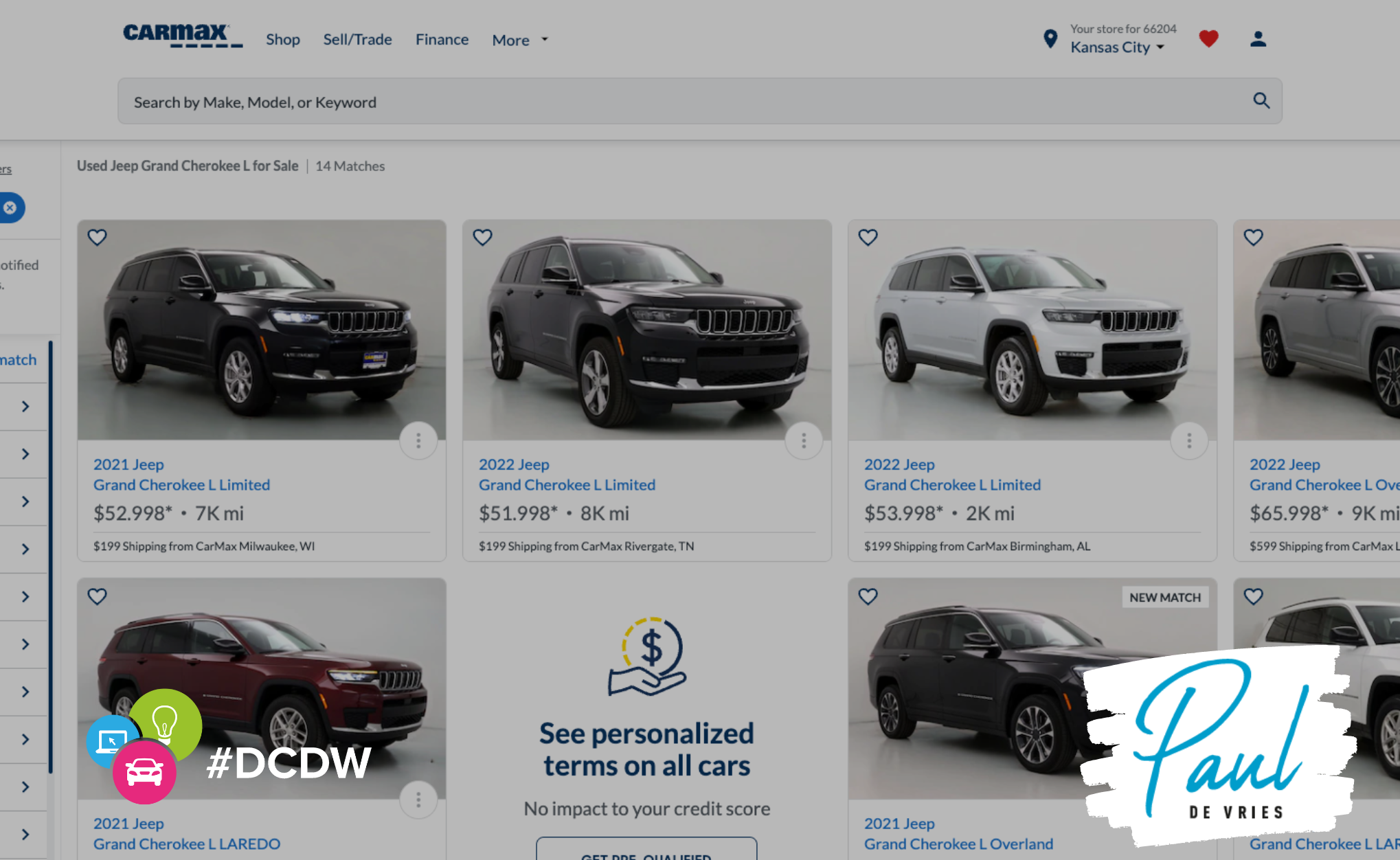
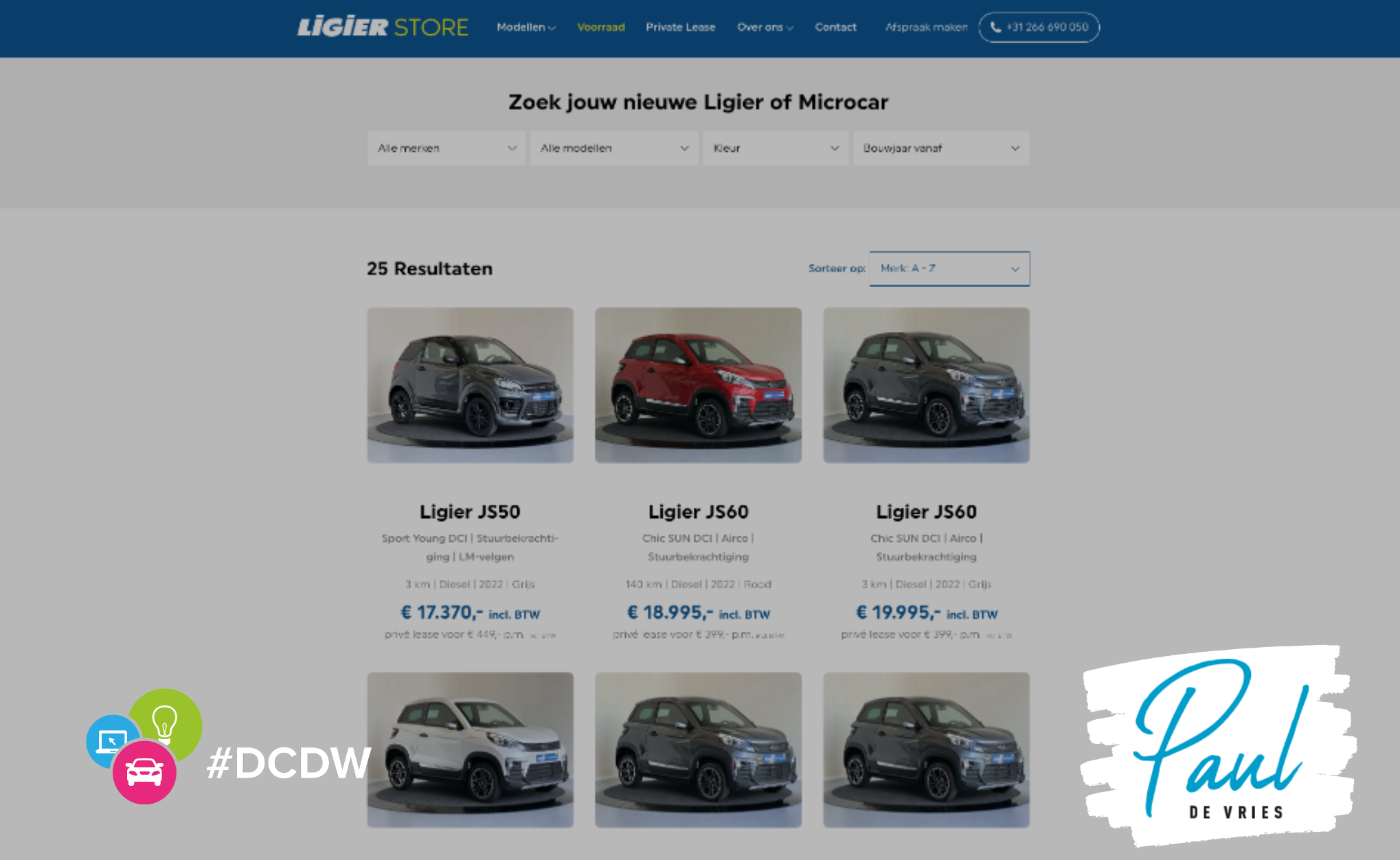
The Search Result Page on our website is simple. We made it based on examples from America, especially from Carmax. This is an overview page where the stock is not below each other, but also next to each other. In addition, there is a first make/model/type and a number of details. There is deliberately no Call To Action (CTA) button to click through. Visitors will now understand in 2022 that everything is clickable, and you can also see that on the SRP page of Carmax, but also of Marktplaats. The idea is if those parties with all their data analysts decide to do it that way, why shouldn’t I imitate it?
The SRP Page of Carmax
The SRP page of the Ligier Store Doesburg
First picture is different
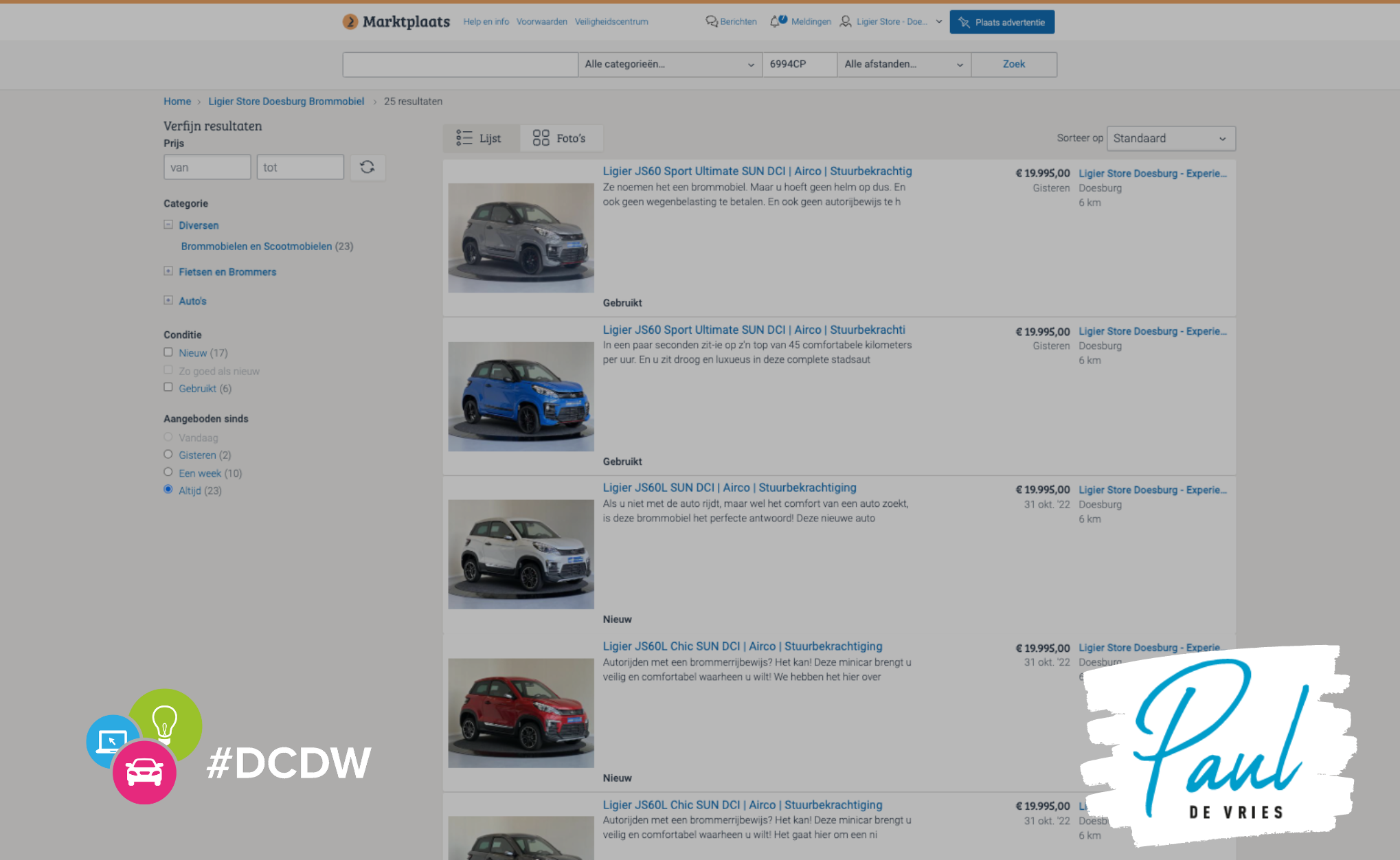
In the Netherlands we are used to taking the first picture from the front left. This is also often consistent with the walk-around you would do in the showroom. At Carmax, and therefore also at the Ligier Store Doesburg, we do not do this. The car is presented on the front right. Why? Yes, it stands out, but so does a bad photo these days. No, at the SRP page on e.g. Marktplaats and Autotrack, see the examples, the text, the price and a CTA (at Autotrack) are on the right. The nose of the car also points in the direction where the information is. If you present links, you divert attention away from the information, while you do not want this. The result is therefore more clicks from the SRP page to the VDP page.
The nose of the Ligiers look at the valuable text
The VDP page
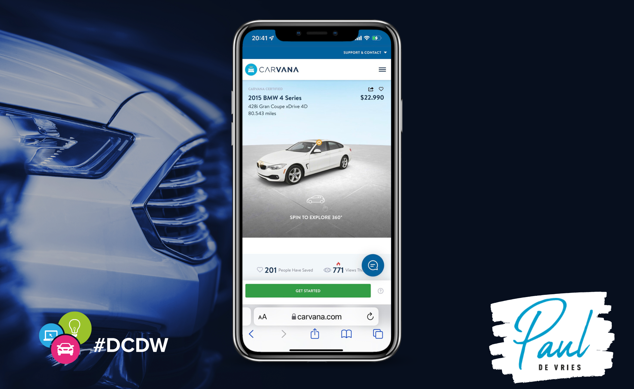
For our VDP page, we were inspired by Carvana’s VDP page. This is more a matter of taste than that I did a data study on it. Both parties spend a lot of money on data, and both will be right, I think. The SRP is like Carmax, the VDP is from Carvana. In terms of design, we have created and optimized the pages for the mobile version. And I discuss that version here.
The VDP mobile page of Carvana
The VDP mobile page of Ligier Store Doesburg
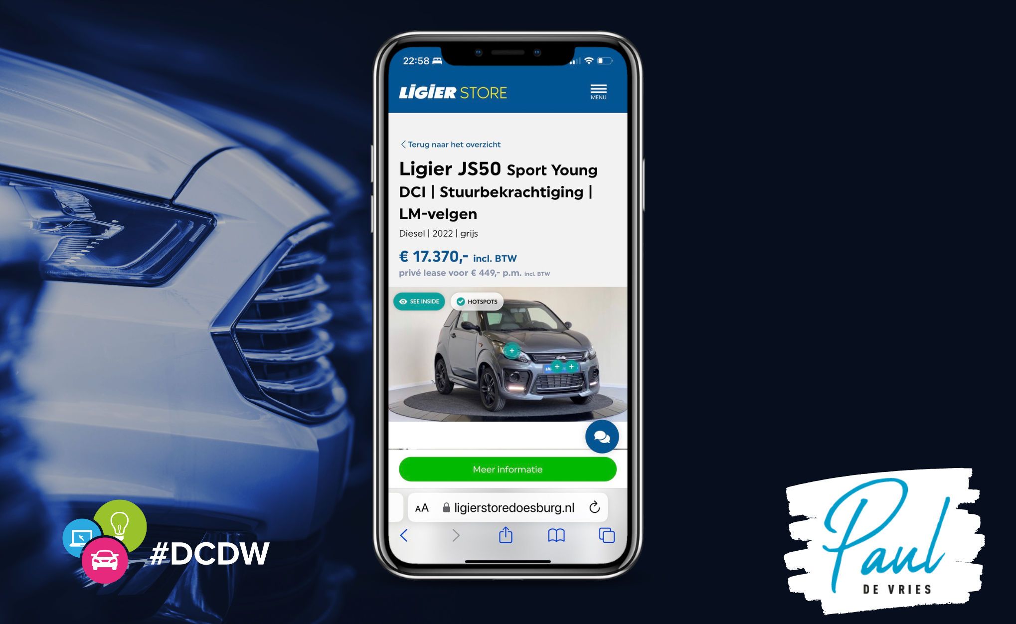
When we look at the CTA, you only see one. The green button. That color was deliberately chosen. Studies show that green works better than blue, red, orange or whatever. At least, as long as the website is not green. It must be a so-called Color Violator. The CTA is a floating button, or a button that moves with the scrolling. The button therefore deliberately remains close to your thumb.
“The CTA button must be a so-called Color Violator.”
A little above that on the right side you have another blue button, with the option to text, email, Whatsapp or call. This button is in the color of the website and is therefore less noticeable, but it is there.
The CTA has only one text, and that is “more information”. The consumer can take further steps behind this button. Such as buying directly online, making a reservation, requesting a trade-in proposal or a private lease quote. So not six CTA buttons, but only 1.
Photos on the VDP page
The photos consist of two parts. The first part is the 360-degree video view by Impel (Spincar) with the possibility to view the car inside and out with the so-called hotspots. The car is the star of the VDP page!
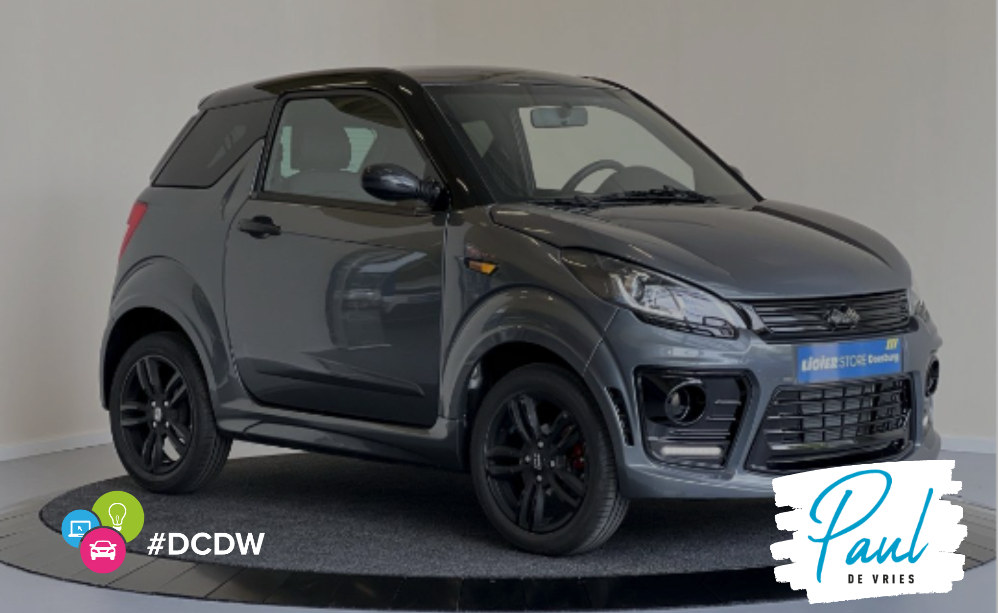
Below that you will find the standard photos because not every portal you advertise on can load the 360 video view (very strange actually). We have already discussed the first photo, front right, but the order after that is also different. The first six photos should tell the whole story of the car.
The second photo is of the dashboard, which you see when you get into the car, the third photo is of the mileage and the fourth is a visual of the Ligier Store with one of our core values. Photo five and six are from the back and side. With this we have been able to present the entire car, and ourselves, and we actually invite the customer to click further.
Turntable for the photos
The turntable we use is from Foto Proto and all the photos and videos we make are made with a simple iPhone. Furthermore, we do not use separate lighting or other materials. The wall behind the cars is round and even in color. And yes, a photo studio with lamps, etc. is better, but unfortunately we don’t have the space for that…
The visuals
In the photo carousel we have a number of visuals. We have a slogan and three USPs and we show them here. The visual below is also included, specifically made for the portals. We know that we can show more information, more videos, more content on our own website, and that is often the reason for customers to click through to the dealer website. We make this easier with a QR code and it is also demonstrable in Google Analytics.
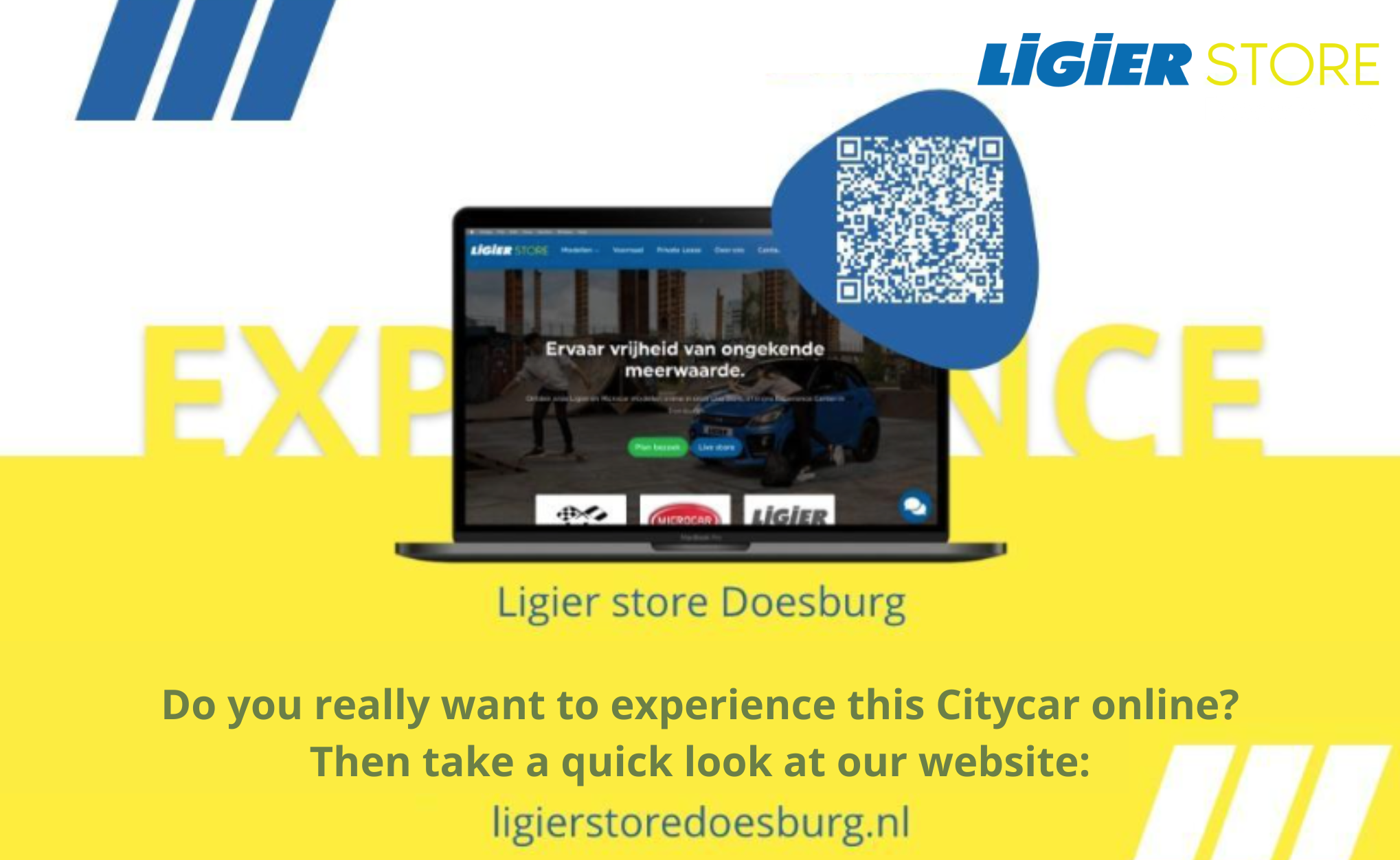
Under the photos on the VDP page
The rest of the VDP page is formatted to display the most relevant information. First, of course, our USPs, why our customers buy from us. Then the specifications with the price, and the private lease price, which are also above the photo and on the SRP. Through the favorites feature of UCC we show the most relevant options, those who want to see more can click further, an action that we measure in GA.
The description is made specific for each car by Taggle, so that ten of the same cars also have ten different descriptions, giving us ten VDP pages that are different in terms of content.
The CTA button and the contact button always stay in the same place, so that they remain prominent. This is not possible on the VDP page on the desktop and we use a pop-up. I’m not a fan of it, but it works…
So…
The SRP and VDP page are the most important pages for making interested buyers interact with the inventory. This also means that you should not just do something, but that you should also take a good look around at what other parties are doing, who often spend a lot of money on research. Take one thing from me, Carmax doesn’t do something just like that and that’s why I like to watch it!


