If you can’t make a phone call directly from your mobile website, you are done as a car dealer!
24 januari 2018, PaulToo often we do not realize that the website is our main showroom!
In 2017 we will see that a development will continue: the use of data via smartphones. For the sake of clarity, I am talking about internet use on the phone. We are already above 50%, mainly thanks to social media, but the development is unstoppable. The number of users who are only online via the smartphone will also increase. These people only have a telephone to go online. At the moment this percentage is 14% and it is expected that this percentage will increase further. An important reason to check what your dealer site looks like on a smartphone. Suppose that 50% of your visitors visit your website via the smartphone before coming to the showroom, then the mobile user experience is essential to get more chances on a deal. And because taxation will no longer become so dominant in 2017, a throbbing online presence is of vital importance.
Another trend
We do see another trend. The ‘call’ is the most dominant and most important online lead and that popularity will increase further in 2017. This explains why Marktplaats was the first portal to make the calls traceable and transparent. It is not the case that just your presence on portals as Marktplaats is important for success, your own website also plays a big role. Your website is in fact the hub where everything has to come together. More phone calls will be made directly from the website. We will show you how dealer websites in 2017 can generate more calls.
Some examples
I have already cracked a few critical notes about the website that the Opel dealers are obliged to use from their importer.(NL) That website is no longer up to date and that is unfortunate in view of the increasing popularity of the brand. When we look at a product page on the mobile website of an Opel dealer, the page where the conversion has to take place, you will see the absence of a clear ‘Click to Call Action’. On the bottom, on the left, is a ‘Direct Contact’ button, but this leads you to another page. And there you have to search for a phone number. As a result, Opel dealers are missing a lot of opportunities for more leads via their own websites.
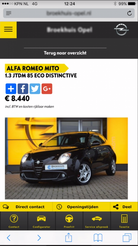
No direct contact with the direct contact button
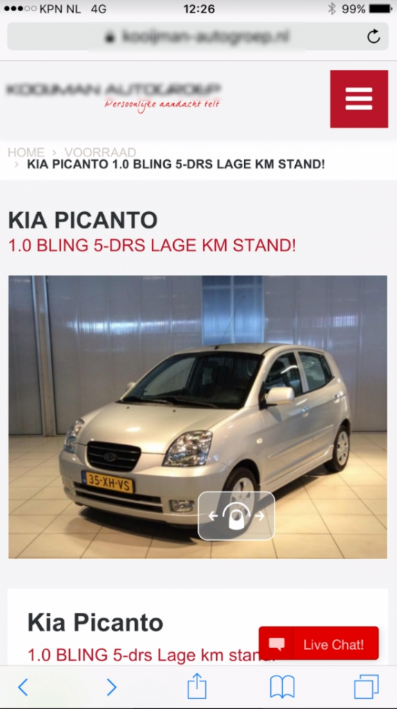
The Kia dealer shows kind of the same story and is not much better. You have to scroll down to be able to call directly. In 2017, everything that takes more effort is a no-go. The live chat is fun, but not relevant on this smartphone page. In addition, it opens a new window and is guided away from the product page. A Click to Call button would have been much better. Also, the chat is not as intuitive as sending a WhatsApp message, so you have to type too much.

No click to call on the first screen
At Toyota Oostendorp they have chosen a DEP website, an American platform. The look & feel can tighten on a (large) number of points, but you can call without scrolling on the product page. And there is another place where you can contact directly (using two different numbers?). There are Click to Call buttons on several pages, like the search page and the results page. This is useful because as a customer you do not have to make that extra click, let alone that the page will jump to a new window.
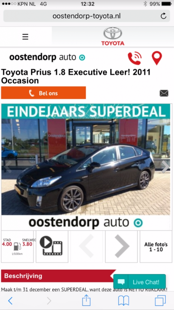
2 click’s to call buttons at the top
In the example below, of a Renault dealer, a newly delivered website, you can see the lack of knowledge of the customer. The mobile VDP page has too much non-content before you get to the important content. A missed opportunity. Why would we want to see a large logo, then a text, then logos, then again text (which is finally relevant), then the price and then just a picture of the car? The customer is mainly visual. Why not show a picture when you scroll down? Then there is a whole lot of content that is not always relevant to that position, then the possibility to ‘share’ (something that should just be at the bottom of the page), again a whole bunch of text and then somewhere at the bottom of a phone number.
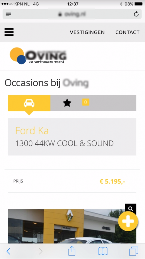
A lot of white areas and meaningless text instead of a photo
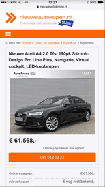
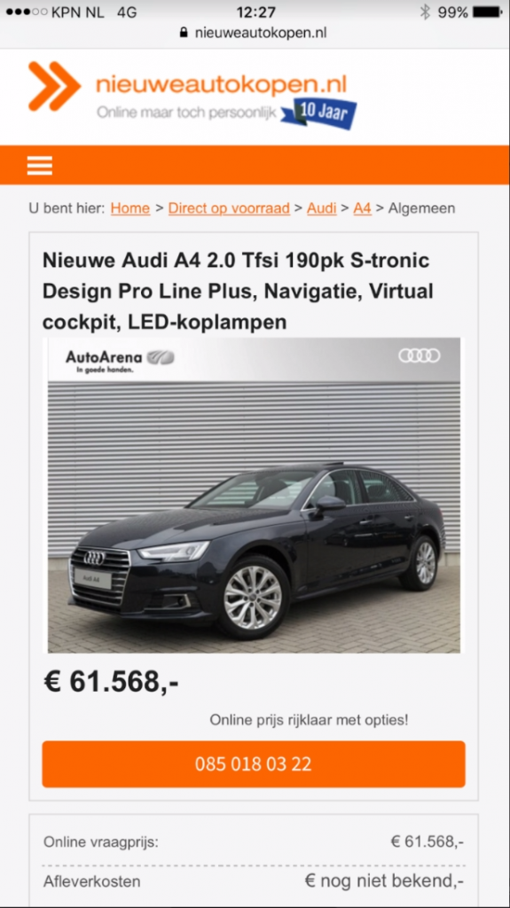
Another example. I am not a programmer, but at Nieuweautokopen.nl we solved this two years ago. The conversion on the VDP page (also on the SRP) can be done in two ways: call or e-mail. Whatever the customer chooses, it has to be easy, without barriers. You can call twice, without scrolling (with a large format smartphone) and you can email below that, with fewer questions than usual. At the time, we did this by analyzing the visitor data and when it turns out that smartphone usage is increasing enormously, you also know that you will probably get more calls. So make use of it!
In the examples above, it is not the dealer’s fault, but the fault of the website developers. They demand a substantial investment from the dealers and deliver a website that might look nice, but does not meet the standards of today. I am not a data specialist, but everyone can see that this can be done much better. Therefore the advice is to pay as much attention to the online showroom (and therefore spend more money on it) as to the physical showroom. Those who will not do so will miss calls, customers and ,ultimately, sales.
About Paul de Vries
Paul de Vries became a Key Automotive Spokesperson at eBay (Marketplace) after selling Nieuweautokopen.nl to eBay back in 2015. Paul is the founder and CEO of the #DCDW Academy and the presenter of the #DCDW Podcast. He is also a by dealers and importers frequently asked speaker in the online automotive industry. Paul is the winner of the prestigious Lighthouse Award 2016 in the U.S.! `Lead the Way op de digitale snelweg’ is Paul’s new book, which can be used as a guide in the online automotive industry. More information is available at: DCDW.nl.


